

Priceline Pty Ltd [2022] ATMO 60 is the latest in a string of unsuccessful attempts by brand owners to monopolise their house colour on retail fit-outs.
Background
The applicant was Priceline, a major Australian pharmacy and retailer of health and beauty products. In 2008, Priceline adopted a specific shade of pink with the express (and, unfortunately for Priceline, documented) purpose of conveying its brand attributes, chief amongst which was femininity.
From 2008 onwards, Priceline was awash with pink. Pink point-of-sale materials! Pink shopping baskets! Pink staff nametags! Pink shopping bags! Pink website headers! Pink website footers! Pink social media avatars! Pink sponsorship paraphernalia! Pink catalogues! The colour pink transcended mere visual adornment: it was a core element of the Priceline brand identity. In evidence were examples of textual reference to the colour pink on promotional materials: for example, the Priceline Pinky Awards and use of the catchphrase “Go Pink”. This sort of evidence is typically very persuasive.
The colour mark application
In 2019, Priceline filed for the colour pink as applied to its retail facades in the following ways:

The application claimed protection for retailing services in class 35 and pharmacy services in class 44. The mark was described as follows in the endorsement (emphasis added):
The trade mark consists of the colour PANTONE PROCESS MAGENTA C applied to the façade of a shop, being the shopfront signage boards, awnings or bulkheads from which the specified services are provided, as shown in the representations attached to the application form.
On examination, and again on appeal, the mark was assessed as possessing precisely zero inherent capacity to distinguish. The finding is unsurprising in and of itself, but was made easy by:
- judicial notice being taken of the traditional connection between the colour pink and femininity; and
- Priceline’s own brand guidelines which described the brand’s unique personality as “feminine”.
The consequence of the mark having no (as opposed to limited) inherent capacity to distinguish is that Priceline had to establish acquired distinctiveness as at the June 2019 filing date. It could not rely on later instances of use.
The evidence
The evidence clearly showed that pink was a core plank of Priceline’s brand identity and was held out to the world as such. It also, said the hearing officer, showed that pink was used as a trade mark and not merely as “decorative getup”. Further, the use of pink was widespread and extensive.
But here’s the issue.
The evidence did not support acquired distinctiveness of the marks as applied for. The hearing officer considered the endorsement wording and concluded that the applied-for mark was not the colour pink (generally) used in connection with the specified retailing and pharmacy services. Rather, it was the colour pink applied to shopfronts in three specific configurations. Only two of those configurations were used, and at just two out of Priceline’s almost 500 locations nationwide.
Here are the storefronts in question:
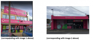
These stores were opened in 2017, so there was only two years’ worth of pre-filing use. There was evidence of use of the colour pink on other Priceline storefronts not corresponding to the images included in the application. This evidence was rightly disregarded.
The fallout
Ultimately, Priceline came unstuck because its evidence didn’t show use of the mark as narrowly-defined in the endorsement. The hearing officer seized on the issue, offering the following not-too-subtle dig at the endorsement wording (at [35]):
I note that the prospects of registration may have been different if the Trade Mark had been defined in a manner that would have allowed the Applicant to rely on a broader range of uses of the Colour Pink throughout the Applicant’s business.
This is not the first time that evidence of use of a colour has failed to support registration of the mark as applied for. The Full Federal Court in Woolworths Ltd v BP plc (No 2) [2006] FCAFC 132 raised the issue squarely, observing at [82] that BP “had used the colour green in ways, and as part of other trade marks, that did not correspond with the trade marks that were the subject of the applications in suit.”
Priceline has also filed this application for a pink swatch “applied to or in relation to the specified goods and applied in relation to the specified services … as a background colour”. The application has been pending for four years and no evidence has yet been filed. It remains to be seen whether the endorsement accompanying that application is sufficient and adequately supported by evidence of use.
Take-aways
The decision contains a lesson for trade mark applicants and their attorneys. When drafting endorsements for colour marks, bear in mind the limiting effect of pictorial representations. Where a decision is made to seek protection for the appearance of a store fit-out, bear in mind that the evidence of use will likely need to predate the filing date and must correspond to the mark as filed: configuration images are limiting, not illustrative.
Oh, and by the way: pink is not just for girls. It happens to look good on everyone.